Design Principles in UI/UX: Complete Notes for Beginners
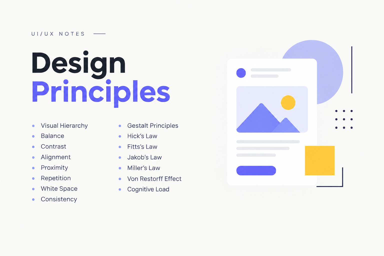
Design principles are the foundation of good UI/UX design. They help designers create interfaces that are visually clear, easy to understand, consistent, accessible and simple to use. In this complete guide, you will learn the most important UI/UX design principles, including Visual Hierarchy, Balance, Contrast, Alignment, Proximity, Gestalt Principles, Hick's Law, Fitts's Law, Jakob's Law, Miller's Law, Von Restorff Effect and Cognitive Load.
What Are Design Principles in UI/UX?
UI/UX design principles are guidelines that help designers make better decisions while designing websites, mobile applications and digital products. These principles help users understand information quickly, navigate easily and complete tasks without unnecessary confusion.
A good UI/UX designer does not focus only on making a screen look attractive. The goal is to create an experience that is useful, understandable, consistent and easy to interact with.
1. Visual Hierarchy
Visual hierarchy is the arrangement of elements in a design according to their level of importance. It helps users understand what they should notice first, second and third.
How to Create Visual Hierarchy
- Use different font sizes for headings and body text.
- Use contrast to highlight important information.
- Place important content in prominent positions.
- Use spacing to separate sections.
- Use visual weight to guide attention.
Example: On a landing page, the main headline should usually receive more visual attention than supporting text.
2. Balance
Balance means distributing visual weight across a layout so that the interface feels stable and organised.
Types of Balance
- Symmetrical Balance: Both sides have similar visual weight.
- Asymmetrical Balance: Different elements create balance through size, position and visual weight.
- Radial Balance: Elements are arranged around a central point.
Balance prevents a UI from feeling visually heavy on one side.
3. Contrast
Contrast is the difference between two or more design elements. It helps important information stand out and improves readability.
Contrast can be created using:
- Color
- Size
- Typography
- Shape
- Spacing
- Visual weight
Example: A primary call-to-action button can use strong contrast so users can easily identify it.
4. Alignment
Alignment means positioning elements so that they visually connect with one another. Proper alignment makes a design look clean, structured and professional.
Common alignment types include left, right, centre and justified alignment. In UI design, consistent alignment also helps users scan content more easily.
5. Proximity
The proximity principle states that elements placed close to each other are perceived as related.
For example, a form label placed close to its input field is naturally understood as belonging to that field.
Good spacing between unrelated sections also helps users understand the structure of a page.
6. Repetition
Repetition means consistently repeating visual elements such as colors, typography, icons, buttons, spacing and components throughout a product.
Repetition creates familiarity and makes interfaces easier to understand. It is also an important part of creating a consistent design system.
7. White Space
White space, also called negative space, is the empty space between and around design elements.
White space does not mean that the area must literally be white. It refers to unused visual space that helps separate and organise content.
Benefits of White Space
- Improves readability
- Reduces visual clutter
- Creates better content hierarchy
- Makes interfaces feel cleaner
- Helps important elements stand out
8. Consistency
Consistency means using similar patterns, components and interactions throughout a product.
If the same type of button looks and behaves differently on different screens, users may become confused.
Consistency should be maintained in typography, colors, buttons, icons, navigation, spacing and interaction patterns.
9. Gestalt Principles
Gestalt principles explain how people naturally organise and interpret visual information.
Important Gestalt Principles for UI/UX
- Proximity: Nearby elements are perceived as related.
- Similarity: Similar-looking elements are perceived as belonging together.
- Closure: People tend to mentally complete incomplete shapes.
- Continuity: Users tend to follow continuous visual paths.
- Figure-Ground: Users distinguish an object from its surrounding background.
- Common Region: Elements inside the same visual area are perceived as related.
10. Hick's Law
Hick's Law describes how the time required to make a decision generally increases as the number of available choices increases.
In UI/UX design, this means designers should avoid presenting users with unnecessary choices when a simpler decision flow is possible.
Example: A checkout page with a clear primary action can be easier to use than a page containing many competing actions.
11. Fitts's Law
Fitts's Law explains the relationship between the size and distance of a target and the time required to reach it.
In practical UI design, important interactive elements should be sufficiently large and placed where users can reach and interact with them easily.
Example: Primary buttons on mobile interfaces should have adequate touch targets and comfortable spacing.
12. Jakob's Law
Jakob's Law suggests that users tend to expect a website or application to work in ways similar to products they already know.
Designers can use familiar navigation patterns and interaction conventions instead of unnecessarily reinventing common UI patterns.
Example: Users generally expect a shopping website to have familiar patterns for search, cart, product details and checkout.
13. Miller's Law
Miller's Law is commonly discussed in UX in relation to the limits of short-term working memory. In practical design, the principle encourages designers to organise and group information rather than presenting large amounts of unstructured information at once.
Example: Breaking a long form into logical sections can make it easier for users to understand and complete.
14. Von Restorff Effect
The Von Restorff Effect, also called the Isolation Effect, describes the tendency for a visually distinctive item to be remembered more easily than surrounding similar items.
UI designers can use visual distinction carefully to highlight important actions or information.
Example: A single primary CTA can be visually distinguished from secondary actions.
15. Cognitive Load
Cognitive load refers to the amount of mental effort required to understand and interact with an interface.
A good UX reduces unnecessary mental effort and helps users complete tasks efficiently.
Ways to Reduce Cognitive Load
- Keep navigation simple.
- Use familiar design patterns.
- Break complex information into smaller sections.
- Use clear labels.
- Maintain consistent UI patterns.
- Avoid unnecessary choices.
- Provide clear feedback after user actions.
Why Are Design Principles Important in UI/UX?
Understanding design principles helps UI/UX designers create interfaces that are not only visually attractive but also easier to understand and use.
- Improves usability
- Creates better visual hierarchy
- Makes navigation easier
- Improves readability
- Reduces user confusion
- Creates consistency across screens
- Supports better user experiences
UI/UX Design Principles: Quick Revision Table
| Principle | Simple Meaning |
|---|---|
| Visual Hierarchy | Shows users what to notice first. |
| Balance | Creates visual stability in a layout. |
| Contrast | Makes important elements stand out. |
| Alignment | Keeps elements visually organised. |
| Proximity | Groups related elements together. |
| Repetition | Creates familiarity and consistency. |
| White Space | Provides breathing room between elements. |
| Consistency | Keeps patterns and interactions predictable. |
| Gestalt Principles | Explains how users perceive and group visual information. |
| Hick's Law | More choices can increase decision time. |
| Fitts's Law | Target size and distance affect interaction time. |
| Jakob's Law | Users expect familiar interaction patterns. |
| Miller's Law | Information should be organised into manageable groups. |
| Von Restorff Effect | Distinctive elements can attract attention. |
| Cognitive Load | Reduce unnecessary mental effort for users. |
Learn UI/UX Design in Delhi
If you want to learn these UI/UX design principles practically and apply them to real website and mobile app projects, you can explore the UI/UX Design Course at UI/UX Institute in Laxmi Nagar, Delhi.
The institute's website describes a portfolio-first, project-based learning approach covering areas such as UX research, information architecture, wireframing, prototyping and usability testing, along with mentor feedback and career support.
Students can learn UI/UX concepts, work on projects and build a portfolio that can be presented during job applications and interviews. Career support includes areas such as resume preparation and interview preparation.
UI/UX Institute – Delhi
Location: G-52, Office No-201, 1st Floor, Opp. Pillar 42, Laxmi Nagar, Delhi – 110092
Phone / WhatsApp: +91 92202 67838
Website: uiuxinstitute.in
Learning UI/UX systematically can help beginners develop the design, research, prototyping and portfolio skills needed to apply for relevant entry-level design roles. Job outcomes can vary depending on an individual's skills, portfolio, experience and the hiring market.
Frequently Asked Questions
What are the basic principles of UI/UX design?
Important UI/UX principles include visual hierarchy, balance, contrast, alignment, proximity, repetition, white space, consistency, Gestalt principles and several behavioural principles such as Hick's Law and Fitts's Law.
Why is visual hierarchy important in UI design?
Visual hierarchy helps users understand which information or action deserves their attention first.
What is Hick's Law in UX?
Hick's Law explains that decision time generally increases as the number of available choices increases.
What is Fitts's Law in UI/UX?
Fitts's Law describes how target size and distance influence the time needed to reach and interact with a target.
Can beginners learn UI/UX design?
Yes. Beginners can start with design fundamentals, UX research, wireframing, UI design, Figma, prototyping and usability testing, and then build practical projects for their portfolio.
Where can I learn UI/UX design in Delhi?
UI/UX Institute offers UI/UX training from its Laxmi Nagar campus in Delhi. Students can contact the institute for current course details, batch timings and fees.
Conclusion
Design principles are an essential part of becoming a professional UI/UX designer. From visual hierarchy and contrast to Gestalt principles, Hick's Law, Fitts's Law and cognitive load, these concepts help designers create interfaces that are clear, usable and user-friendly.
The best way to understand these principles is to combine theory with practical projects. Start with the fundamentals, practice in Figma, analyse existing websites and apps, create your own designs and gradually build strong UX case studies for your portfolio.