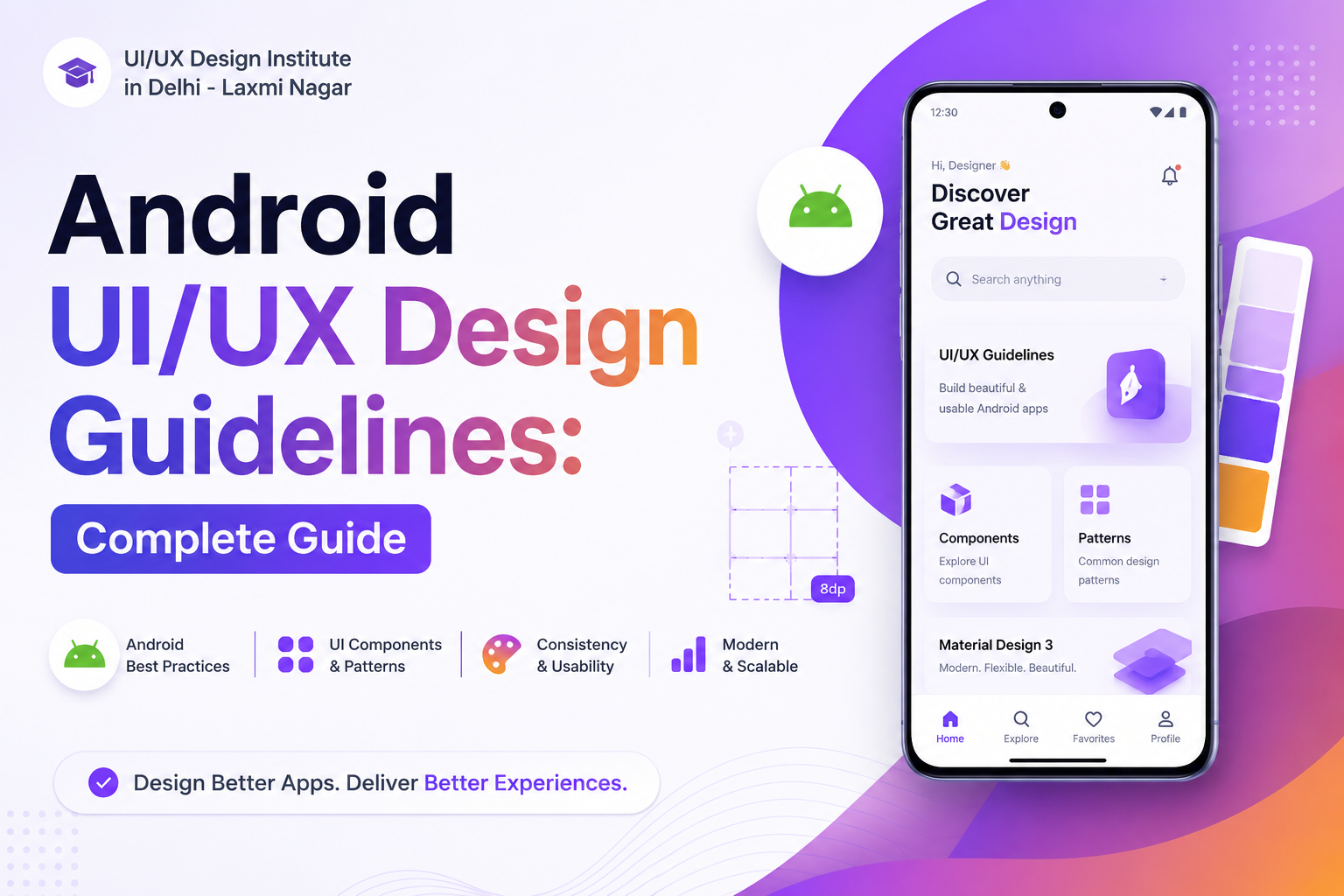
Android UI/UX Design Guidelines: Complete Guide for Better App Design
At our Laxmi Nagar studio, one of the first things we tell new students is that an Android screen can look great in a mockup and still fail the moment a real user opens it on a mid-range phone with a cracked screen protector and shaky internet. Android UI/UX design is about respecting that reality — the interface has to stay simple, predictable, accessible, and fast on devices that aren't always the latest flagship. Whether you're a beginner working on your first Android project or a working designer sharpening your process, these guidelines cover what actually matters when the app leaves Figma and reaches real users.
In this complete guide, we will explore the most important Android UI/UX design principles, including layout, navigation, typography, colors, spacing, components, accessibility, responsive design, and usability.
What Is Android UI/UX Design?
Android UI design focuses on the visual interface of an application, including buttons, cards, icons, typography, colors, forms, navigation bars, and other interface components. UX design focuses on how users interact with the application and how easily they can complete their goals.
A professional Android UI/UX designer combines both disciplines to create applications that look visually appealing while remaining easy, fast, and comfortable to use.
Why Are Android UI/UX Design Guidelines Important?
Android applications are used across smartphones, tablets, foldable devices, and different screen sizes. Following established UI/UX design principles helps designers create a consistent experience across devices.
- Improves user experience and usability
- Makes navigation easier and more predictable
- Creates visual consistency across screens
- Improves accessibility for different users
- Helps users understand actions and interface elements
- Creates a more professional and trustworthy application
- Reduces confusion and unnecessary user interactions
Key Android UI/UX Design Guidelines
1. Keep the Interface Simple
Simplicity is one of the most important principles of Android UI design. Avoid adding unnecessary elements that can distract users from their primary task. Each screen should have a clear purpose and visual hierarchy.
Use whitespace, clear headings, recognizable icons, and concise content to make the interface easier to understand.
2. Use a Consistent Layout
Consistency helps users understand how an application works. Maintain consistent spacing, typography, button styles, colors, icons, and component behavior throughout the application.
For example, if a primary action uses a particular button style on one screen, the same visual language should be maintained throughout the app.
3. Follow a Clear Visual Hierarchy
Users should immediately understand what is important on every screen. Visual hierarchy can be created using font size, weight, spacing, contrast, positioning, and color.
A typical hierarchy may include a page title, supporting information, primary content, secondary information, and a clear call-to-action.
4. Choose Typography Carefully
Typography directly affects readability and usability. Use a clear typeface and maintain a logical hierarchy between headings, subheadings, body text, labels, and buttons.
- Use readable font sizes
- Maintain sufficient line spacing
- Use font weight to create hierarchy
- Avoid using too many font styles
- Maintain strong contrast between text and background
5. Use Color With Purpose
Colors should communicate meaning rather than simply decorate the interface. A consistent color system can help users identify primary actions, warnings, success messages, errors, and interactive elements.
Avoid using too many colors in a single interface. Establish a primary color, secondary colors, background colors, text colors, and semantic colors for states such as success, warning, and error.
6. Maintain Proper Spacing
Proper spacing makes an Android interface easier to scan and interact with. Consistent margins and padding create visual rhythm and prevent the interface from feeling crowded.
Designers should use a consistent spacing system instead of choosing random distances between UI elements.
7. Design Touch-Friendly Components
Android applications are primarily used through touch interactions. Buttons, icons, navigation controls, and other interactive elements should therefore have comfortable touch areas.
Avoid placing important interactive controls too close together because this can increase accidental taps and negatively affect the user experience.
8. Create Simple Navigation
Navigation should help users understand where they are, where they came from, and where they can go next.
Before designing an Android application, create a clear information architecture and user flow. This makes it easier to determine which screens belong in the primary navigation and which should remain secondary.
9. Design for Different Screen Sizes
Android devices come in many screen sizes and form factors. A good UI/UX design should not depend on one fixed screen size.
Use responsive layouts and flexible components so that the interface can adapt to different smartphones, tablets, and other Android devices.
10. Focus on Accessibility
Accessibility should be considered from the beginning of the design process. An accessible Android application should be usable by people with different visual, motor, hearing, and cognitive needs.
- Use sufficient color contrast
- Do not communicate information through color alone
- Use clear labels for interactive elements
- Provide readable text
- Consider screen-reader users
- Make important controls easy to interact with
Important Android UI Components
A UI/UX designer should understand how common Android interface components work and when they should be used.
- Buttons
- Cards
- Text fields
- Dialogs
- Bottom navigation
- Top app bars
- Navigation drawers
- Tabs
- Lists
- Search components
- Checkboxes and radio buttons
- Switches and sliders
- Floating action buttons
Android UI/UX Design Process
A professional Android UI/UX design process normally starts with understanding the user and business requirements before moving toward visual design.
- User Research: Understand the target audience and their problems.
- Information Architecture: Organize content and application features.
- User Flow: Define how users move from one task or screen to another.
- Wireframing: Create the basic structure of each screen.
- UI Design: Apply typography, colors, components, icons, and visual hierarchy.
- Prototype: Create an interactive prototype to simulate the application.
- Usability Testing: Test the design with users and identify usability problems.
- Iteration: Improve the design based on feedback and testing.
Android UI/UX Design Tools
UI/UX designers can use several professional tools to design and prototype Android applications. Figma is particularly useful for wireframing, UI design, component systems, prototyping, and developer handoff.
Other tools may be used for graphic assets, image editing, motion design, usability testing, and design documentation depending on the project.
Common Android UI/UX Design Mistakes
Even visually attractive applications can provide a poor user experience if fundamental usability principles are ignored.
- Using too many colors and fonts
- Creating complicated navigation
- Ignoring different screen sizes
- Using inconsistent buttons and components
- Making text difficult to read
- Ignoring accessibility
- Adding unnecessary animations
- Creating crowded layouts
- Skipping usability testing
- Designing without understanding the target users
How to Learn Android UI/UX Design?
If you want to build a career in UI/UX design, start by learning design fundamentals such as typography, color theory, layout, visual hierarchy, user research, wireframing, prototyping, and usability testing.
After learning the fundamentals, practice by designing real-world mobile applications. Create complete case studies that demonstrate your research, user flows, wireframes, UI screens, prototypes, and design decisions.
For students looking for practical UI/UX design training in Delhi, UI/UX Design Institute in Delhi can be explored for structured learning and portfolio-focused design education.
Frequently Asked Questions About Android UI/UX Design
What are Android UI/UX design guidelines?
Android UI/UX design guidelines are principles and best practices that help designers create usable, consistent, accessible, and responsive Android applications. They cover areas such as layout, navigation, typography, colors, components, spacing, interaction, and accessibility.
What should I learn first for Android UI/UX design?
Beginners should first learn UI/UX fundamentals such as user research, information architecture, wireframing, typography, color theory, layout, usability, prototyping, and responsive design.
Is Figma useful for Android UI/UX design?
Yes. Figma is widely used for creating wireframes, UI designs, reusable components, prototypes, design systems, and developer handoff.
How can I create an Android UI/UX portfolio?
Create 3–5 detailed case studies based on realistic problems. Show the complete design process, including research, problem statements, personas, user flows, wireframes, UI design, prototypes, usability testing, and final improvements.
Can I learn UI/UX design without coding?
Yes. Coding is not mandatory to start a career in UI/UX design. However, understanding basic HTML, CSS, mobile development concepts, and developer handoff can help designers communicate more effectively with developers.
Conclusion
Android UI/UX design is about much more than making an application look good. The best Android experiences combine visual design, usability, accessibility, responsive layouts, intuitive navigation, and user-centered thinking.
By following consistent design principles and continuously testing your designs, you can create Android applications that are easier to understand, easier to use, and more enjoyable for users.
If you are planning to build professional UI/UX skills and create a strong portfolio, explore the UI/UX Design Institute in Delhi for further information about UI/UX design learning opportunities.
Quick Answer: Android UI/UX Design Guidelines
The most important Android UI/UX design guidelines are simplicity, consistency, clear visual hierarchy, readable typography, purposeful colors, proper spacing, touch-friendly controls, intuitive navigation, responsive layouts, accessibility, and usability testing.